The Atmosphere Myth: Why a Festival Needs More Than a Theme Colour
Festival atmosphere takes more than a theme colour: align sound, language and setting so a visual idea feels coherent from arrival to the final cue.
A row of coral flags looks bright above a festival entrance, but the welcome desk is silent, the signs use formal office language and the first stage announcement sounds like a train platform. The colour is clear; the atmosphere is not. Festival atmosphere depends on how visual choices meet the sounds, words and surroundings people actually encounter.
A theme colour can help people recognise a festival across a poster, wristband and sign. It cannot, by itself, tell them how to behave, what kind of gathering they have joined or what feeling the organisers intend. Think of colour as the cover of a book: it invites a certain expectation, while the pages have to carry it through.
Colour sets a cue
Colour is useful precisely because it is easy to repeat. A shade can appear on ticket emails, stage banners, volunteer lanyards and printed programmes, linking separate parts of an event. That visual continuity makes a festival easier to recognise, especially when visitors move between a gate, a food area and a performance space.
But repetition alone is not coherence. If the chosen colour suggests a gentle, outdoorsy gathering, while the event’s signs shout instructions in urgent capitals and the sound system fills every gap, the pieces pull in different directions. A good visual motif offers a cue; the other details need to answer it.
Before settling on a colour, write down the qualities it is meant to suggest in plain language. “Warm and welcoming” gives a design team something to test against a sign or announcement. “On brand” is less useful: it names an internal standard, not an experience a visitor can hear or see.
Sound fills the gaps
Sound shapes a place even when no one is performing. The welcome at a gate, the volume of background music, the tone of stage introductions and the noise of equipment all become part of the event’s character. A calm-looking setting can feel hurried if instructions arrive as clipped commands; a lively colour scheme may feel strangely flat if every space is acoustically dead.
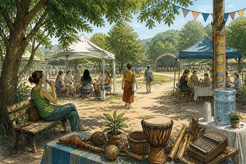
Decide what sound should do in each area rather than choosing one musical mood for the whole site. A main stage may call for energetic introductions. A craft tent may need speech to remain easy to hear. A food queue may work better with low background sound than with announcements competing over conversation.
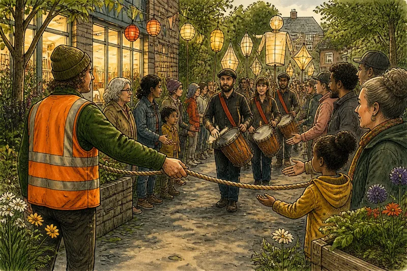
Listen for transitions too. The handover between performances, the announcement before doors open and the quiet after a final set all have a tone. If each is treated as an afterthought, visitors experience the joins as abrupt even when every individual programme item is polished.
Language carries character
Signs and spoken announcements are not neutral containers for information. “Please wait here” can sound considerate or curt depending on its wording, placement and delivery. A festival’s character becomes more believable when its practical language uses the same human qualities as its posters and performance descriptions.
Choose a small set of verbal habits that staff and designers can use consistently: direct instructions, friendly invitations, or playful phrasing, for example. Keep essential information plain. A joke may suit a programme note, but it should not obscure where a toilet is or what visitors should do when a performance is delayed.
Give volunteers sample phrases for recurring moments, such as welcoming people, explaining a queue or directing someone to a quieter area. They need not memorise a script. A few natural examples help avoid the jarring shift from an inviting sign to a brusque interaction at the gate.
Setting gives the theme a home
The physical setting can support a visual idea without being decorated from end to end. A fabric banner, a hand-painted noticeboard or a cluster of coloured stools may be enough if these details appear where people need orientation or naturally gather. The aim is not to cover every surface; it is to let the motif belong to the place.
Start with what is already there: brick walls, trees, a village hall, temporary fencing or a concrete forecourt. Ask which materials and shapes make sense in that setting. Paper bunting might soften a hard-sided hall; it may look flimsy and out of place in a windy field. Reusing the site’s existing textures can make a festival feel rooted rather than installed.
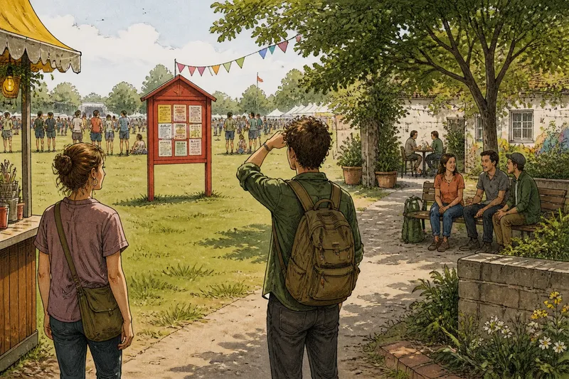
Practical details affect atmosphere as much as decoration. A clear route to the entrance, readable signs at decision points and a visible place to ask for help can make a busy site feel more composed. These are not merely operational fixes: they shape what visitors notice and how confidently they move through the event.
Where does coherence come from?
Can one colour still be a useful theme?
Yes. A recurring colour can help identify the event and connect its printed and physical materials. Treat it as one recognisable thread, not as a substitute for consistent sound, language and setting.
How can a small team align the details?
Agree on a few descriptive qualities and use them to review signs, announcements, staff wording and site materials. A short shared reference is often more useful than a large mood board that no one consults while making practical decisions.
What should organisers notice during a site walk?
Pay attention to the moments when visitors have to choose a direction, wait, ask a question or move from one activity to another. Those transitions reveal whether the intended character survives outside the poster and main stage.
How can a festival use colour without overdecorating?
Place the colour where it helps people recognise an entrance, information point or programme area. Let the surrounding site remain visible, and use materials that suit the location rather than forcing the same decorative treatment everywhere.
Check the joins
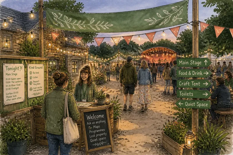
Imagine a small evening festival built around the idea of a shared garden, with green used on its posters and entrance banner. The organisers notice that their formal signs and loud, rapid stage introductions make the event feel more like a busy venue than a garden gathering. They revise the signs to use plain, welcoming phrases, ask presenters to introduce acts at a more conversational pace and place a few planters beside the information point. Visitors can now encounter the same gentle cue in what they see, hear and read, without turning the whole site into a garden set.
Use a simple review before the event: choose one visitor journey, then compare each detail with the qualities the festival wants to convey. Walk from the entrance to an activity and on to a place to sit. Note where the mood changes unexpectedly, and decide whether the cause is a sign, a sound, a material or a missing cue. Fix the mismatch that most affects the journey before adding more decoration.
- At the entrance: Does the first welcome sound like the festival’s intended character?
- At decision points: Can visitors find their way without signs changing tone or style?
- Between activities: Do sound levels and announcements make transitions feel abrupt?
- At rest areas: Do materials and nearby noise support the kind of pause the event invites?
- Across staff interactions: Do volunteers have clear, natural wording for common questions?
A coherent festival atmosphere does not require every detail to match or every surface to carry the theme colour. It needs the important details to agree often enough that visitors can recognise the event’s character as they move through it. Choose the colour, then make sure the welcome, the words and the setting know what it means.